Design for hallway viewing
A classroom door is usually seen while people are moving, so the message must be understandable quickly. Use a short headline, large lettering, and one main visual theme. Save small text for pieces students will stop to read at eye level.
Measure around the window, handle, signs, and safety hardware before printing. Nothing should block required information or interfere with the door’s operation. Follow school rules for adhesives, coverage, and fire safety.
Choose a practical fall focal point
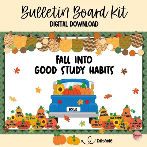
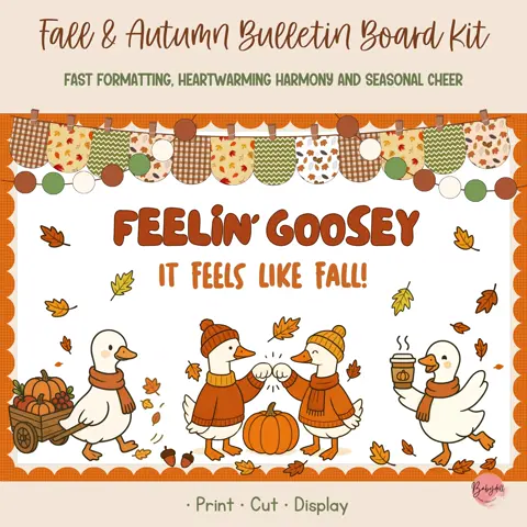
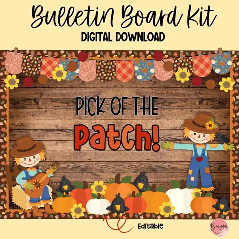
A scarecrow, pumpkin patch, autumn tree, apple truck, woodland scene, or cozy sweater theme can anchor the design. Place the focal artwork off center if the door window occupies the middle, then balance it with the headline and student pieces.
Limit the palette to a few warm colors plus one contrast color. Cream lettering on deep green or dark brown can be easier to read than several similar orange shades layered together.
Include every student clearly
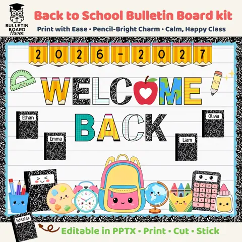
Use leaves, pumpkins, apples, acorns, or small signs for student names. Prepare a clean list and check spelling before printing. Keep blank editable pieces available for class changes and avoid placing names near the floor where they can be damaged.
If names are not appropriate for your setting, display student-created goals, favorite books, kind actions, or drawings instead. A shared class message can create belonging without publishing personal information in a public hallway.
Assemble the door in removable layers
Lay the complete design on the floor and photograph it before installation. Attach the background and border first, followed by the headline, focal image, and student pieces. Layering in this order makes spacing easier to correct.
Use removable materials approved by your school and check the display after busy transitions. Store replacement pieces and adhesive nearby. A door display that is easy to repair will continue looking welcoming throughout the season.