Start with a natural color system
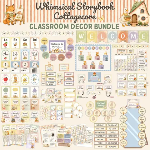
Choose three to five colors inspired by the theme, such as cream, warm brown, moss green, muted orange, and dusty blue. Repeating this small palette across bulletin boards, labels, and storage creates connection without requiring every item to come from the same set.
Use the strongest pattern or illustration in one focal area. Supporting spaces can rely on solid colors, simple borders, and clear labels. This gives detailed woodland artwork room to feel special.
Give each animal or element a purpose
Woodland animals can identify classroom groups, reading genres, supply areas, or student responsibilities. Leaves, acorns, trees, and mushrooms can frame information or become movable pieces for names and student work.
Avoid scattering characters across every wall. When an element has a consistent meaning, students can use it as a visual cue. A fox might always identify the library area, while leaf shapes might hold rotating examples of learning.
Layer fall accents onto year-round pieces
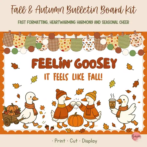
Build the room around neutral labels and practical displays that can stay all year, then add autumn leaves, pumpkins, and seasonal messages for fall. When the season changes, remove only those accents instead of replacing the entire classroom system.
This layered approach saves time and storage. It also prevents the room from feeling unfinished after a seasonal display comes down, because the essential organization remains in place.
Protect readability and calm
Keep schedules, directions, and academic references separate from highly decorative scenes. Use generous spacing, high contrast, and consistent headings so students can locate information quickly.
Walk through the room from a student’s perspective and photograph each wall. A photo often reveals crowded areas that are easy to overlook in person. Remove or relocate anything that competes with the information students need most.