Start with the mood of the room
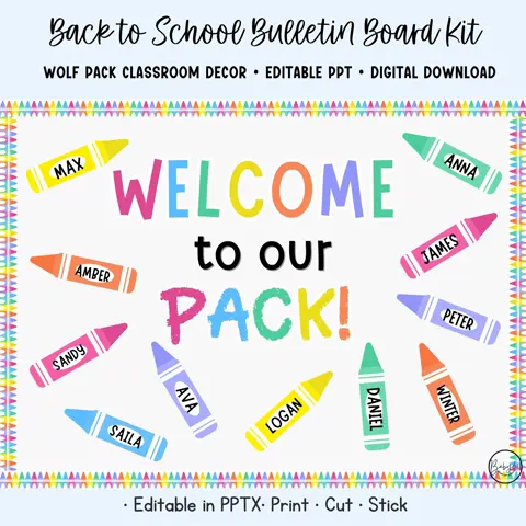
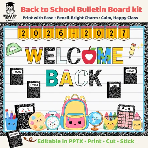
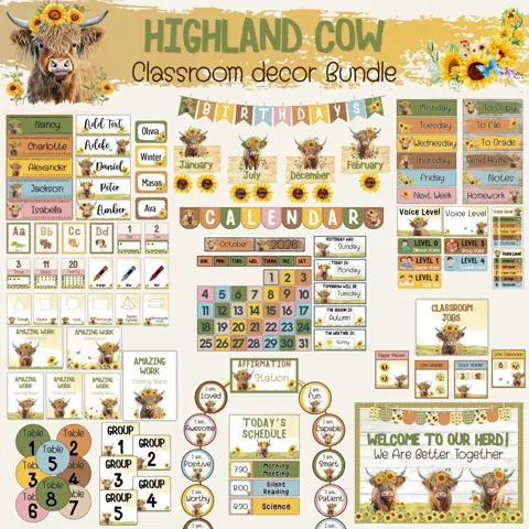
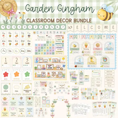
Think about how you want students to feel when they enter. Bright primary colors can feel energetic and playful, pastels can feel gentle and cheerful, and earthy neutrals can create a grounded atmosphere. There is no perfect palette; the best choice is one you can use consistently.
Select one main color, two supporting colors, and one or two small accent colors. This gives you enough variety for different classroom areas without making every display compete for attention.
Work with what you already have
Look at permanent features such as walls, flooring, cabinets, desks, and storage bins before purchasing or printing decor. A palette that connects to one or two existing colors will make the room feel more intentional.
You do not need to replace useful materials that do not match perfectly. Group similar colors together, repeat your chosen border or label style, and let consistent typography bring different pieces into the same visual system.
Protect readability
Use the strongest contrast for information students must read quickly, including schedules, procedures, and learning displays. Decorative patterns work best as borders or accents rather than behind small text.
Print a test page and view it from across the room. If the lettering disappears into the background, simplify the color combination or add a solid backing layer before preparing the full set.